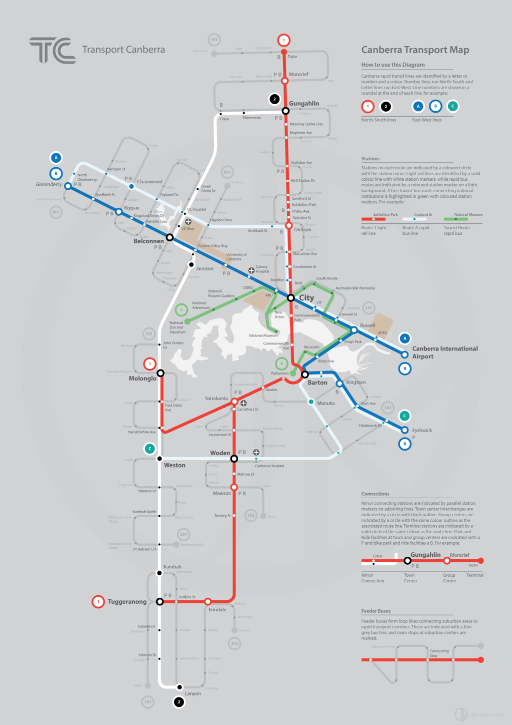


A planning and graphic communication project imagining the future of Canberra’s (newly under construction) light rail system and a fantasy rapid and feeder bus network. The purpose of the exercise was to address Canberra’s notorious reputation as a spread out and car dominated city and make the map about finding fast and simple connections to high quality public transport corridors. As such the map steers away from an over-reliance on geography that the current Transport Canberra bus map has, and focuses on highlighting the North-South and East-West corridors proposed for the light rail, which form the central X of the diagram, and which are conceived as developing as the main high-medium density corridors of the city into the coming decades. The angles of these corridors are based on Canberra’s famous axial geometric and functional layout, which makes the diagram more geographically accurate within the older central area of the city while making it more schematic in outlying suburban areas.
Supplementing the two light rail corridors are a proposed network of rapid buses, utilising routes already mooted for new rapid services by the ACT government. These connect the Western town centres, bypassing the city, and pick up two other East-West connections between Weston Creek, Woden and South Canberra, and North-West Belconnen and North Canberra respectively. In order to distinguish these rapid bus routes from light rail services, the colour scheme of these lines is reversed, with dark colour on light, rather than light on dark. A free tourist bus connecting national attractions is highlighted in a mid-tone of green, distinguishing it as an important element distinct from the commuter system, but following the same logic of dark on light.
Suburban areas have been ‘rationalised’ as a grid of suburban centres with a coordinate system defined by each ‘arm’ of the rapid transit system. The scheme then proposes a simpler and more legible network of feeder buses which loop through this grid and return to the relevant transport corridor, providing coverage services to areas not serviced directly by the rapid network. Compared to the ‘spaghetti bowl’ of routes on the current map this is designed to make connections between existing suburbs and rapid corridors far easier to follow and utilise. These services are rendered in a thinner grey line to give them a lower visual hierarchy compared to the rapid network, and indicate that they are generally of a lower frequency.
Important destinations such as hospitals and universities are marked, as well as locations of bike and ride and park and ride facilities, to again encourage connections from existing suburbs. The number of each transport line is marked in a roundel at the start and end of each line.
